
It's still a work in progress, but I want to keep adding useful tools that can do calculations automatically or generate bits of code that would be a pain to write by hand. The first tool is a slope calculator to make elements more responsive.
Problem
This one was a last-minute addition to the site. While creating a page, I ran into a problem - I wanted an element to be 690 pixels wide at a screen width of 1150 pixels, but 513 pixels wide at a screen width of 575 pixels. It was easy to do with media queries (i.e. breakpoints), but the jump was too jarring.
Solution
By calculating the slope between the starting and ending element width, it was possible to generate a combination value (using calc in CSS) that gave the right results. For this one, a width value of "calc(336.00px + 30.78vw)" worked perfectly.
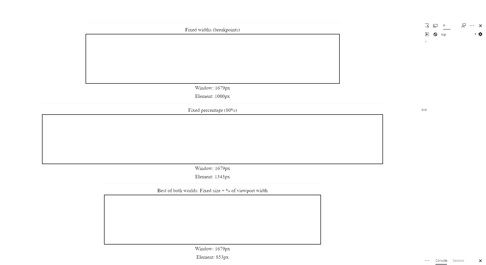
Fixed width is too jumpy, but fixed percentage wastes space at smaller widths.
Jeremy Paquette 2020
Bonus
By combining this technique with media queries, it's possible to smoothly scale smaller and smaller as the screen shrinks. For example, if the ending screen width of this first slope is 575px, a media query at exactly 575px would start another slope that could make the element even smaller.